#Instachange! Inspired By The Amazing Things You Do.
A new look, a new style!
That’s what’s Instagram is all about anyway.. New things.
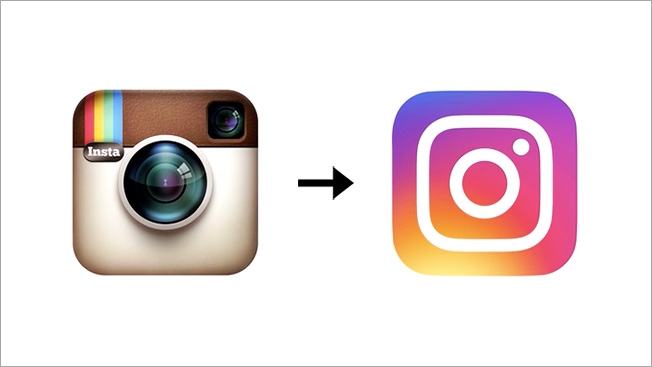
On May 11, 2016 came the big change that no one really expected.
“How could such a huge App make such a huge change ahead?”
That’s the first thing that came around our friends’ minds who contacted us to share their astonishment regarding the big news.
Inspired by the previous app icon, the new one represents a simpler camera and the rainbow lives on in gradient form.

We at Better’fly Lebanon asked some of our designers about their opinion.
Here’s what they said:
Jess
It’s interesting how they redesigned it in a modern fun way but they definitely lost their identity.
It used to be distinctive and vintage.
Rol
My first impression was like “Oh.. bye bye little tiny camera ” it seems that they wanted to modernize it and follow colors trends. We’ll get used to it!
Tati
Instagram is much better, it’s breathing now that the icons are smaller, more trending & easier to the eyes!
Well, most of us around here like it! Why not?
Improvements are a must and old things can get boring..
Yes we are used to the old icon. Sure we loved it, but it’s time for a Make-Over.
Change is good!
—-
Nathalie Jeha
Better’fly Lebanon
Author Profile
Latest entries
 Blog ListJuly 7, 2023Best Places to Visit in Lebanon in 2023
 Blog ListMay 17, 2023Top activities to keep you entertained during Summer 2023 in Beirut
 Blog ListMay 10, 2023Digital Marketing Strategies for Lebanese Businesses
 Blog ListSeptember 18, 2017Lady Gaga – Sick And In Pain


Trackback: 3mainland